PERCY JACKSON AND THE OLYMPIANS
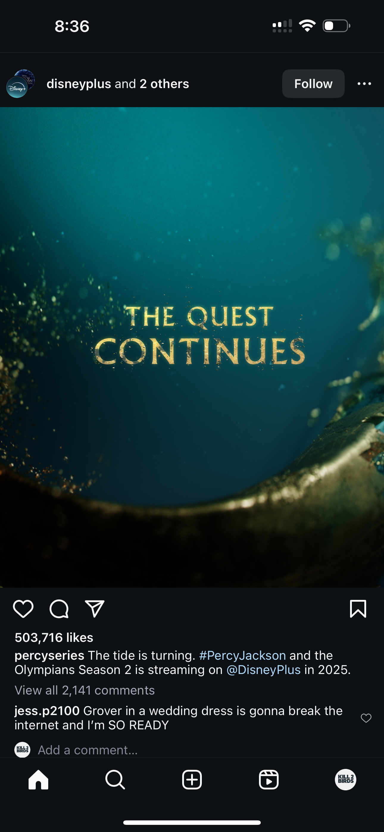
THE TIDE IS TURNING.
Percy Jackson is back — and this time, the storm runs deeper.
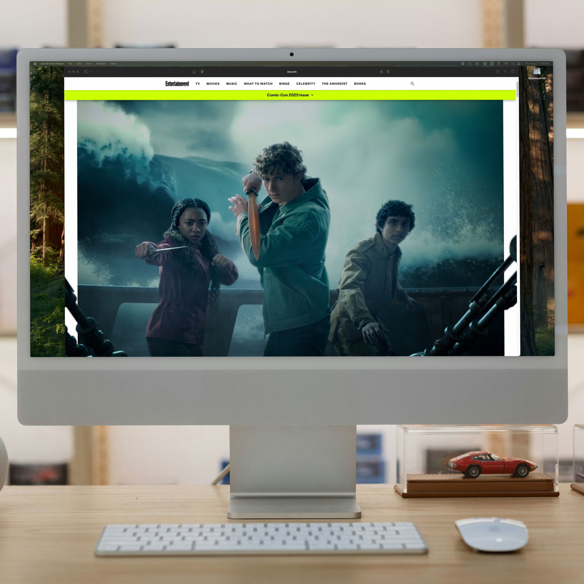
Based on The Sea of Monsters, the second book in Rick Riordan’s best-selling saga, Season 2 dives headfirst into darker waters. As Percy and crew navigate new threats, new alliances, and literal monsters of myth, the stakes only rise.
So did the scope of our work.
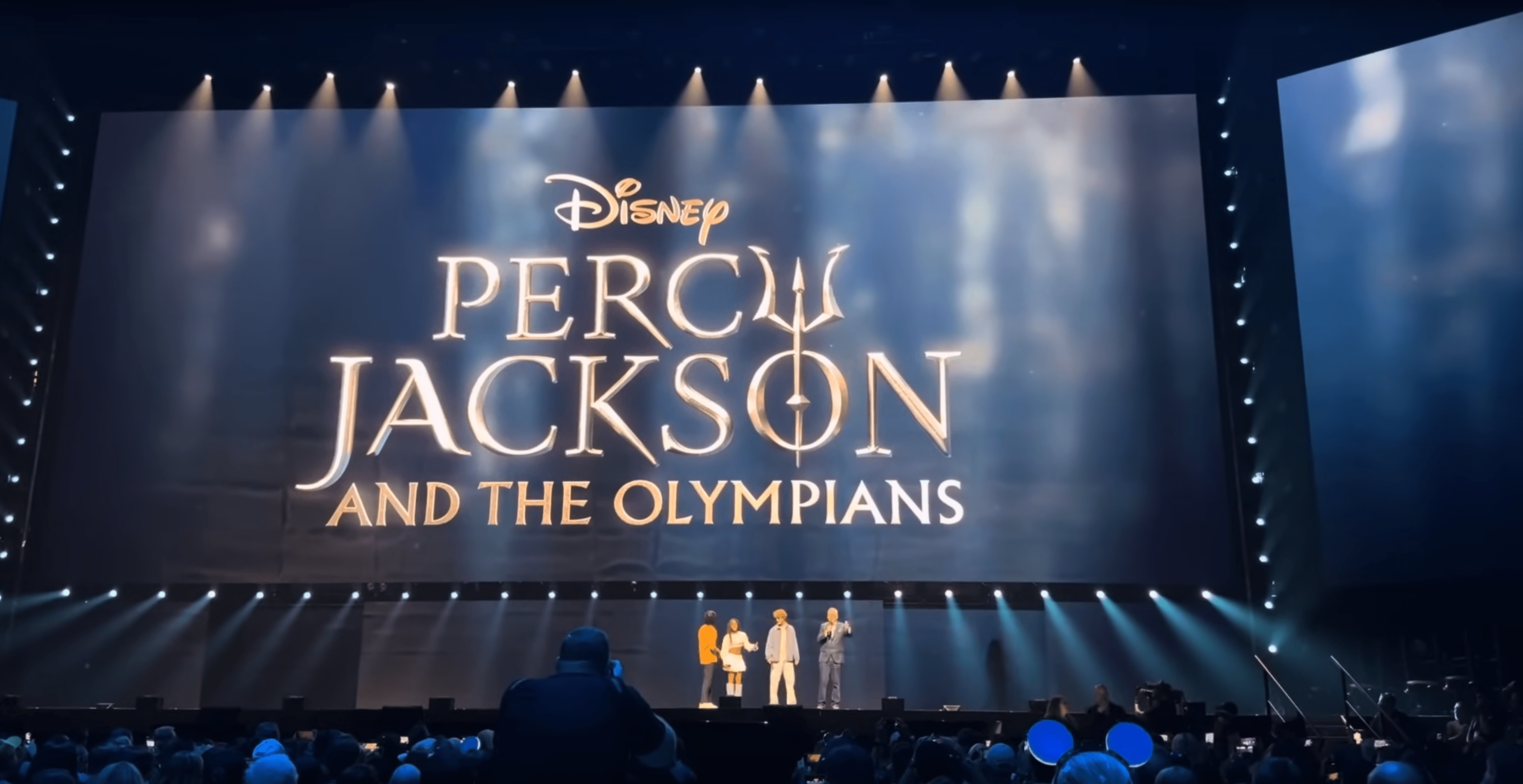
After designing the signature promo visuals for Season 1, we were invited back to push even further for the launch of Season 2. This time, the campaign extended across massive screen graphics for D23, out-of-home takeovers for Comic-Con, and a full-blown animated cover for Entertainment Weekly. All that on top of a full Promo and Social Package.
Bigger stage. Bigger splash. Let’s go.
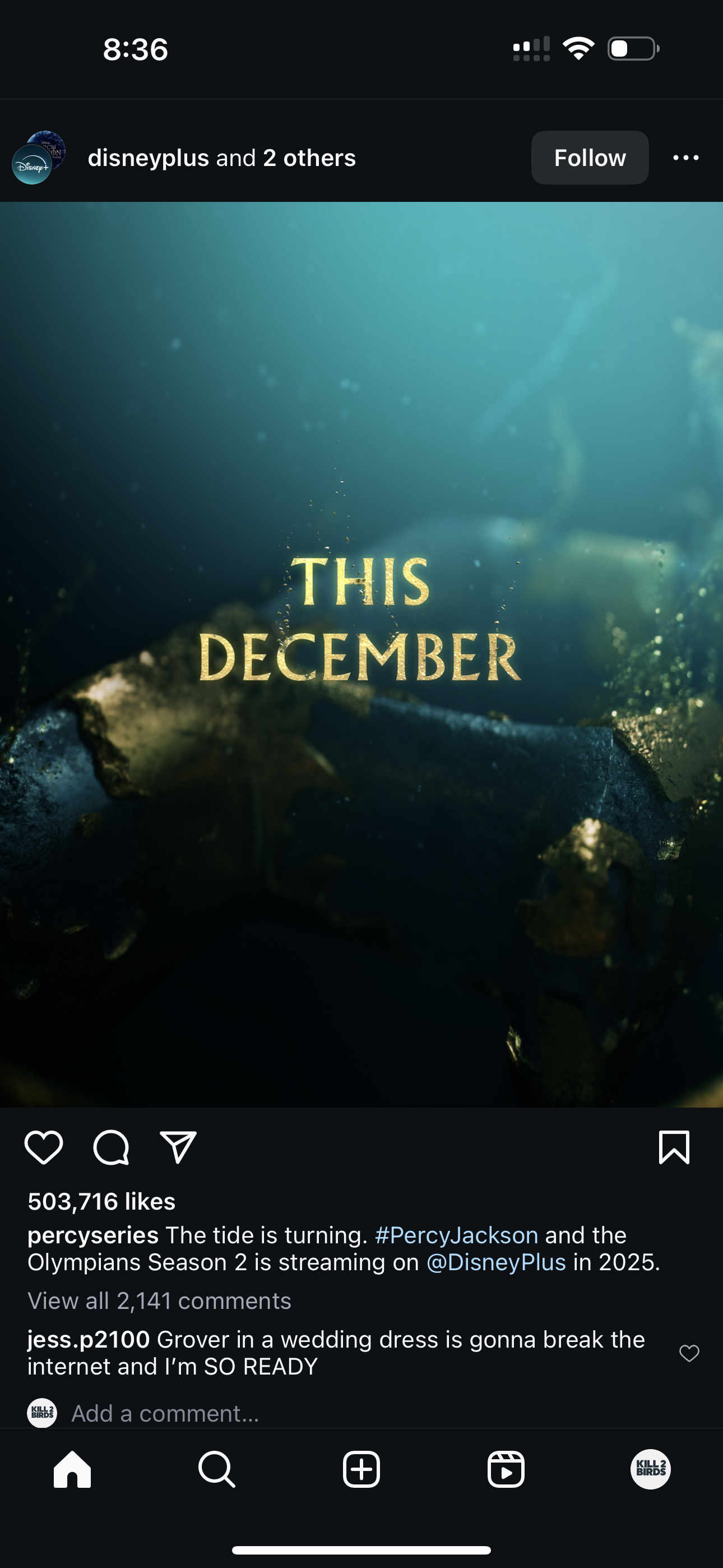
FROM THE DEPTHS.
Our overarching concept begins at the bottom of the Sea of Monsters — where darkness reigns, gold glints, and danger stirs.
The world we built is fluid, layered, and elemental. Deep blue and glimmering gold become our visual opposites. Forces that don’t blend, but collide. The design lives in this tension, reflecting the trials Percy and his friends must face.
Each title card moves with the pull of the ocean, flickering with unseen energy, as currents twist around the messaging.
For the main title reveal, we break the surface.
The main title animation [used as the hero logo resolve across the entire campaign] opens with an expansive overhead shot. The Percy Jackson logo surges from the deep, breaking through the surface with force and sending a towering splash skyward before settling.